Qumështorja Vita
Project overview
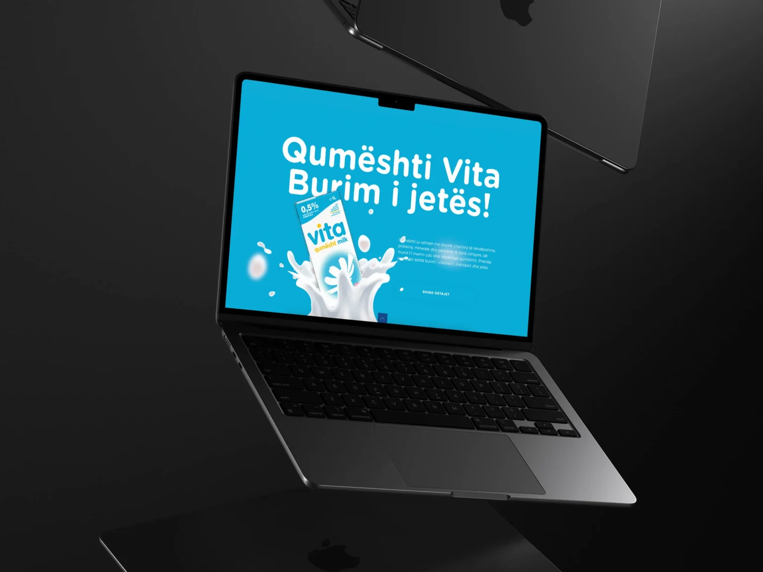
Our task was to carry that familiarity into an online shop, with clear product information and straightforward browsing.

Trust, built in.
The design takes its cues from the product: clean, plain and unfussy, with a palette that reads as fresh rather than clinical. It loads quickly and behaves the same on a phone in a shop aisle as on a desktop.
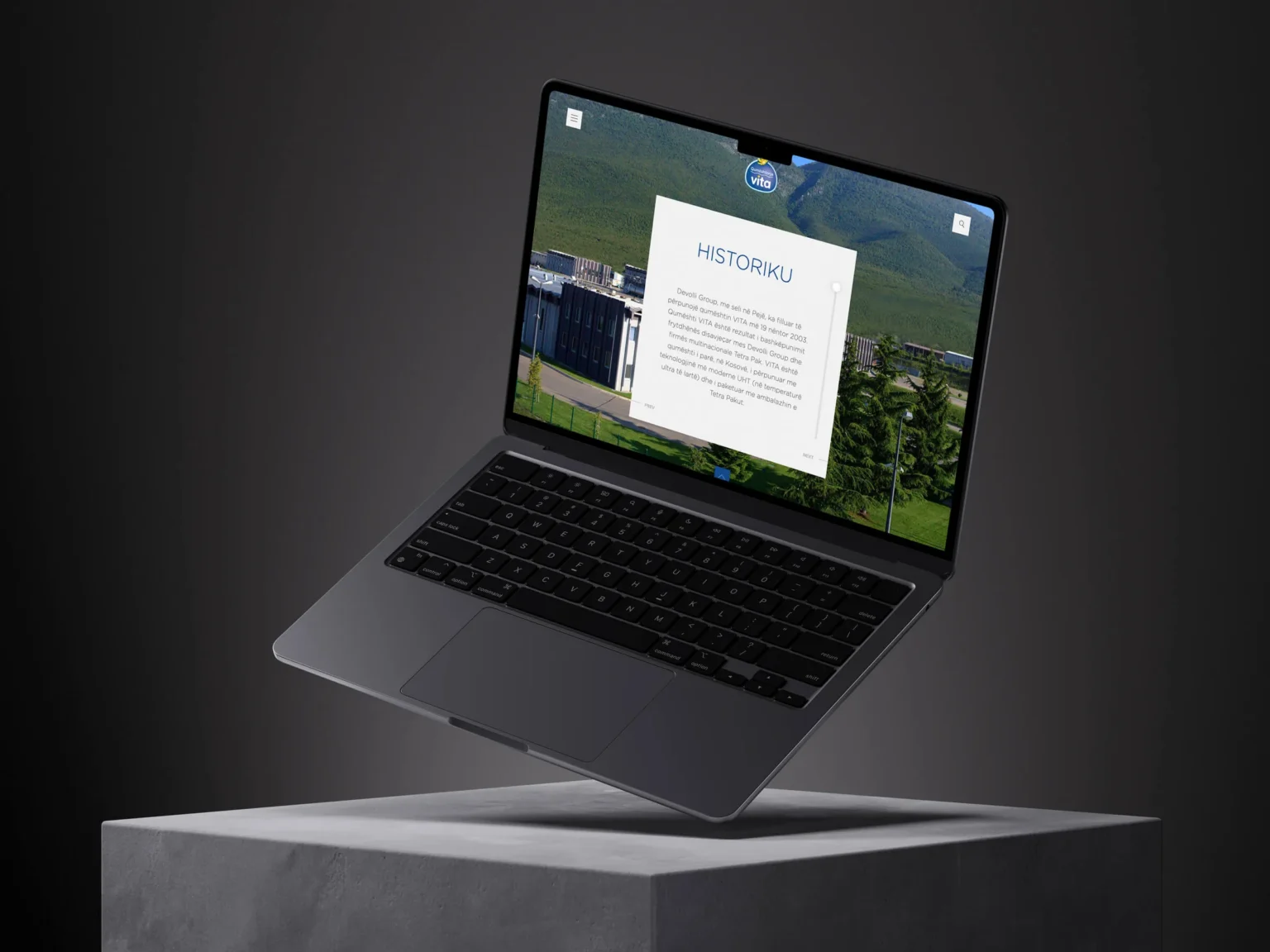
Milk is browsed by variant rather than by name, with 3.2% and 0.9% each given its own panel, so a shopper lands on the exact carton they came for. A history section sits alongside the catalogue, carrying the dairy’s own story.
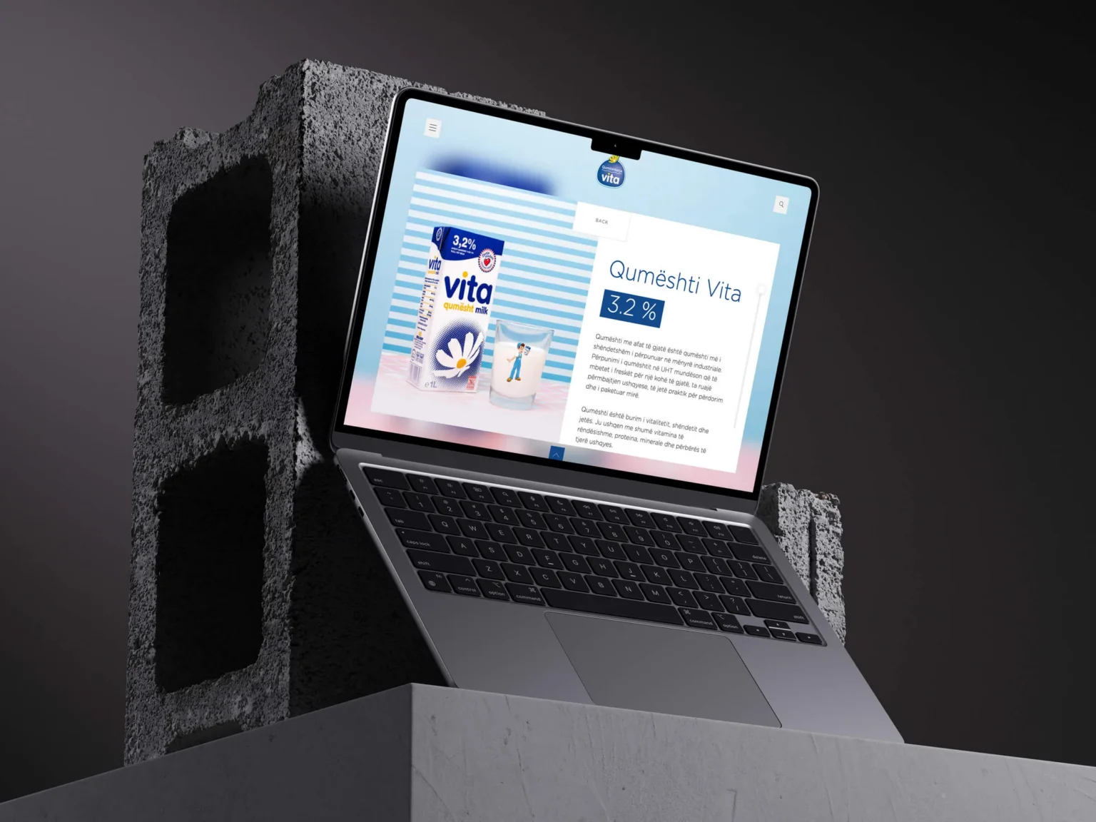
The catalogue is the centre of the site. Each product is presented in full, with reviews beside it, so a customer can decide without hunting for information. Contact and support details stay visible throughout. For a brand built on trust, being easy to reach is part of the product.
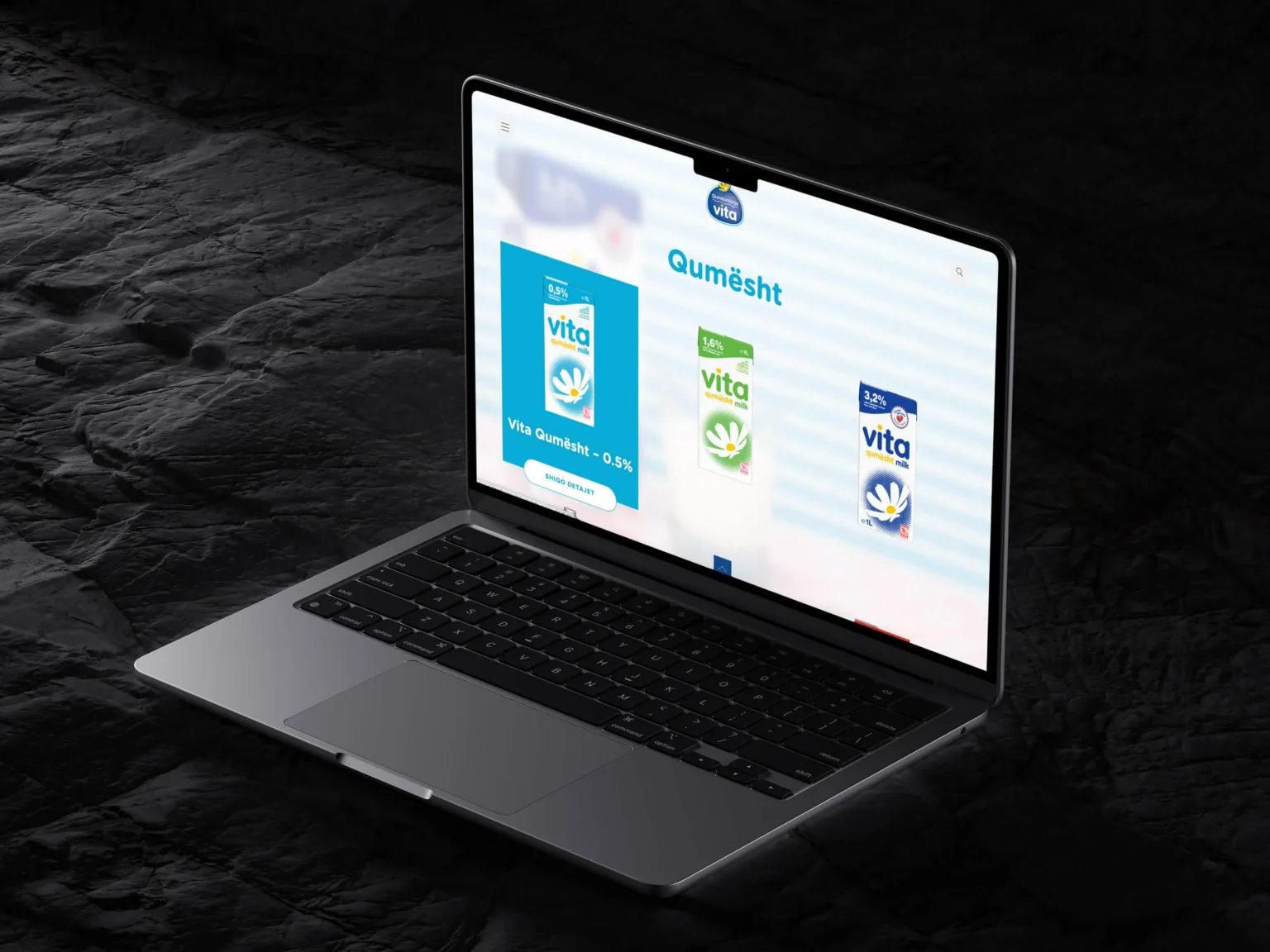
The site brings product information, reviews and customer support together, with a catalogue structure that accommodates additions to the range.
Planning the next website for an established brand? Let’s talk.
What we delivered
- Product catalogue and category structure
- Product detail pages with reviews
- Customer support and contact routes
- Online shop and ordering
- Responsive front-end build