Mokne
Project overview
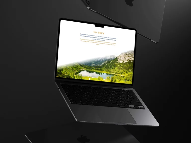
Translating that into a website meant subtraction rather than addition. Every element we took away made the remaining ones carry more weight, until the page felt as still as the source it describes.
Built on restraint.
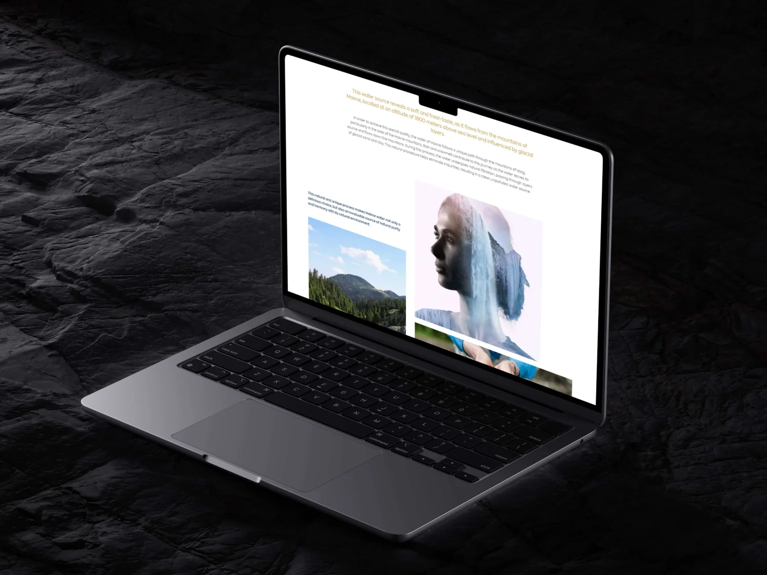
Soft tones, generous space and atmospheric photography hold the page quiet. Compositions drift rather than snap, echoing the way water actually moves. Nothing is decorative for its own sake.
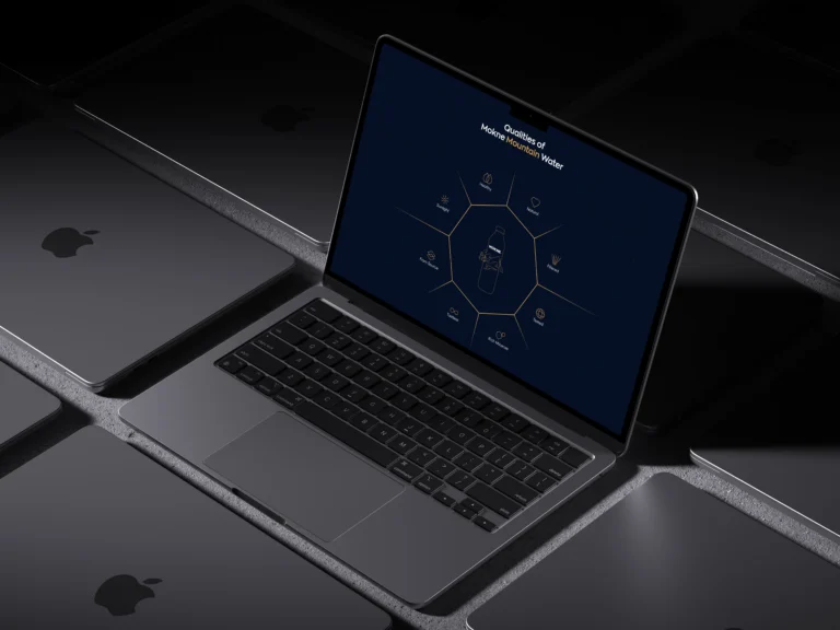
The source carries what the copy would otherwise have to argue: the spring, the bottle and the water’s certification each take a full screen, and the story page sets the water against the mountain it comes from.
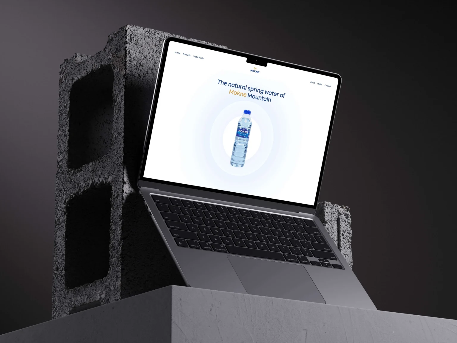
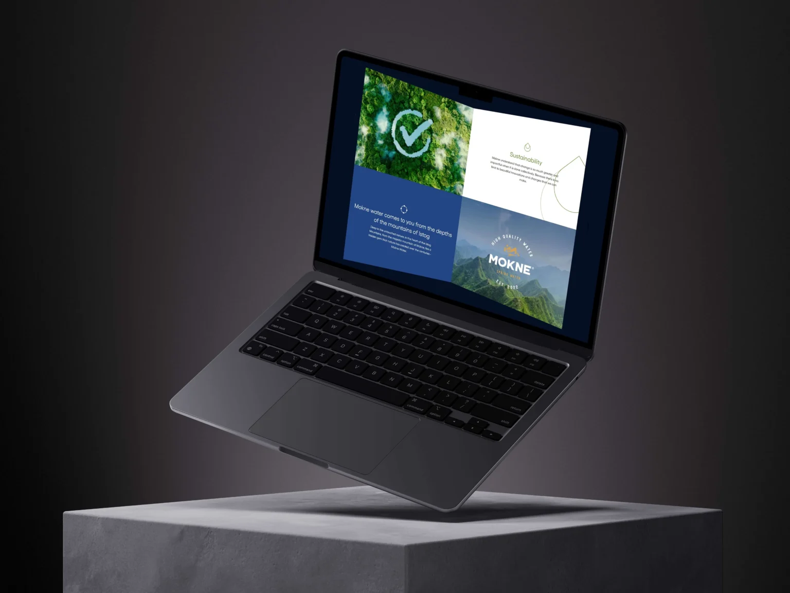
The story unfolds as you scroll instead of arriving all at once, so Mokne’s origin and character reveal themselves at the pace of reading.
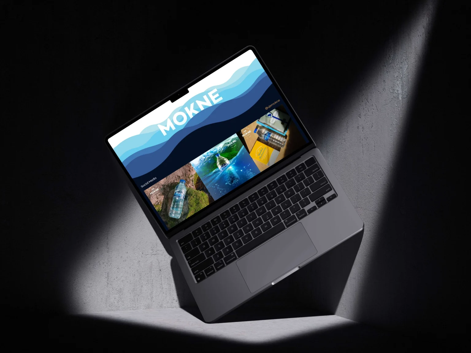
The site carries Mokne’s story through restrained design, with the source and the water at its centre.
What we delivered
- Art direction and visual language
- Scroll-led narrative structure
- Photography selection and treatment
- Responsive front-end build
- Performance and image optimisation